
Here is a multidimensional scaling plot of 9 different populations of Pakistan I've collected in the Dodecad Project. The "Pakistani" population from Xing et al. (2010) consists of Arain agriculturalists from the Punjab region.

It is fairly obvious that there are 5 clusters in these first two dimensions, and GALORE analysis confirms it:
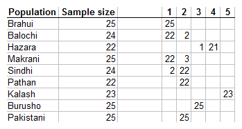
The isolated Kalash form cluster #5, and the part Mongoloid Hazara #4. The Burusho are a genetic and linguistic isolate, falling in cluster #3. The other 2 clusters comprise of multiple populations: Cluster #1 the Brahui, Balochi, and Makrani and could very well be termed "Balochistan". Cluster #2 comprises of the Sindhi, Pathan, and Punjabi samples.
UPDATE:
Here are two additional MDS plots. In the first one the Kalash have been removed; in the second one both the Kalash and the Hazara:


6 comments:
Nice graph. What happes if you remove the Kalashi samples?
I though the Makrani were mainly African. If that's the case, isn't it odd that they are clustering with the Brahui and the Balochi?
That's not the case
http://2.bp.blogspot.com/_Ish7688voT0/TP0c79zjSqI/AAAAAAAAC_c/RpU9dxNapWg/s1600/ADMIXTURE_7.png
There is definitely African admixture in the Makrani sample, and secondarily in the Sindhi one, but it is minor.
Yes, this kind of cluster analysis shows that most identifiable populations have an identifiable population genetic signature (although a few are indistinguishable) that the vast majority of their members match (with a few matching other nearby populations, probably due to introgression).
But, this is hardly notable. At a sufficient level of detail, for example, I am sure that one could ethnically distinguish the Hatfields from the McCoys (two famous blood feuding hillbilly families in the United States in the 19th century).
But, particularly when one gets as fine grained as these populations within Pakistan, one loses all sense of scale. A chart that shows that Balochi and Pathan tribes belong to different clusters looks not all that different with suitable adjustments for the units used in the axis scale, from a chart showing that West Eurasians form a genetically distinct cluster from East Eurasians. Are the clusters in Pakistan comparable to the clusters in Europe or Africa? This analysis doesn't even obviously provide FST statistics (an admittedly imperfect measure) to gauge that on some kind of common scale.
Without a sense of scale, it is hard to see how this cluster analysis is showing anything other than that human genetic variation is generally well ordered geographically, with a handful of outlier populations. This analysis, standing alone, doesn't even really meaningfully distinguish between "ancesteral source" and "admixed" populations. It simply notes that one population has a different autosomal mix in ancestry distinctive markers than another.
Put another way, it isn't obvious what these distinctions really mean. You can tell that groups of people who live near each other and speak the same language and share the same religion share more ancestors than two people chosen at random. So what? A few people unfamiliar with genetics might be shocked that this is true. But, for anyone familiar with the literature and aware of how the samples are constructed, it is self-evident.
I can see a point to this kind of analysis when it illustrates some larger point, like the genetic coherence of a linguistic group (with the outliers being particularly interesting), perhaps with date estimates of the common ancestors of that group, or when it allows us to distinguish the impact of different historical waves of migration that help us to understand how current populations reached their current character.
Looking at uniparental markers, whose haplogroups can be ordered by mutational lines of descent, there is, at least a genological-geographic narrative inherent in even raw data.
But, at this fine grained level of cluster analysis it is hard to tell what the data are telling us, in part because it is hard to tell what the scale of the differences is and what the dimensions of variation correspond to heuristically.
What do the respective dimensions align with in the larger picture? Do those dimensions relate to anything "real" or are they simply mathematically derived indexing tools parsing basically random variations? Are the dimensions in the Pakistan analysis even the same dimensions used in that analysis? How close or far apart are Pakistani populations relative to other populations in South Asia, in Eurasia, in the world?
My point is not to denigrate the hard and careful analysis being done here for not being complete. Hell, simply making more people aware of that there are meaningful distinct population substructures in places that most people reading will have experienced only a tiny subset of, as one must to make sense of the labels in the charts, probably has merit in and of itself as a short of scavenger hunt approach to understanding global ethnic diversity. But, it is an honest question about the point of the enterprise which I can't fully answer myself.
Charles Ilya Krempeaux: The Makranis have African links from the female side, mostly. Many Sindhi feudals imported African female slaves; so did the Omani Arabs of Gwadar (A coastal city of Balochistan which was in control of Oman in the 17th century). According to Sengupta's seminal study, the Y-DNA analysis reveals E3a at a frequency distribution of 5%. On the other hand, mtDNA analysis reveals approx 40% L1a, L2a, L2b, L2d.
The 'Pakistani' in the figures/graph are actually 'Punjabi' ethnic group. All the ethnic groups (Punjabi, Sindhi, Kalash, Hazara, etc.) are Pakistanis.
Post a Comment